Have you ever looked at a chart to get the gist of what’s going on? You see the prices moving up and down. Yet, you can’t help but wonder, “Why?” Basic charts, with their open, high, low, and close prices, are like the bones of a story. They show you the aftermath—the result of a battle. But what if you could have an X-ray view of that battle itself? What is a footprint chart? It is the tool that throws you directly onto the financial battlefield. Moreover, it provides a complete X-ray vision of the market’s heart. It reveals the exact volume of buy and sell orders fought over at every single price level. This powerful perspective allows you to witness the precise forces—the raw demand and supply—driving price changes.
By revealing where aggression and liquidity truly are, a footprint chart trading gives you a crucial tactical advantage. Consequently, it turns chaotic market noise into a coherent, actionable story. Therefore, traders can make choices much more confidently than with standard charts alone.
Key Notes:
- What is a Footprint Chart?
- Understanding the Numbers
- Role of Delta
- How to Read the Footprint Chart
- Types of Footprint Charts
- Benefits and Comparisons
What are Footprint Charts?
A footprint chart is a powerful trading tool that goes beyond the basic information of a standard chart. Unlike a regular candlestick that only shows open, high, low, and close prices for a period, a footprint chart provides much more. Specifically, it provides a granular, three-dimensional view of market activity. It is a visual representation of order flow showing each executed transaction at specific prices inside each bar. The chart shows volume traded by both buyers and sellers at every price level. Typically, buying volume appears on the left and selling volume on the right.
This unique feature gives more profound insight into market dynamics and liquidity. For example, it reveals where real liquidity was reached and who acted more aggressively. Moreover, it shows the precise forces that drive price movements. As a result, you see the “who, what, and where” of each price change. Consequently, it provides insight that no other chart can match. In short, it turns every candle into a detailed story.
A Deeper Look Inside the Candlestick
A footprint chart, sometimes called a cluster chart, tells the whole story of each candlestick. It gives the candle a voice and a detailed history. In particular, it shows the internal workings of the market’s auction process. Specifically, it displays total volume traded at each price and separates buyer and seller activity. This separation reveals whether buyers or sellers drove the action. Thus, its greatest strength lies in showing who had the edge. Furthermore, it allows you to picture how a price movement actually occurred. You learn who controlled the move and where liquidity peaked. Therefore, each bar becomes more than a price marker. Instead, it becomes a map of intent showing movement and motivation.
An Illustrative Example
For example, when the price moves from ten to twelve dollars, a basic candlestick only shows the rise. However, a footprint chart reveals more. It can show aggressive buyers trading five hundred contracts at $11.50. Additionally, it might show another three hundred contracts traded at $11.75. This level of detail demonstrates sustained conviction that a simple bar cannot convey. Also, it shows where sellers tried to counter that buying pressure. Consequently, you gain a clear sense of the move’s strength and possible limits.
Understanding the Numbers: The Language of Market Behavior
To read the market’s story, you must learn its vocabulary. The numbers on a footprint chart form that language. So what does a footprint measure? It reports the overall volume, as well as the size and sequence of executed orders. These figures give the quantity of buy and sell orders at specific prices. Typically, buy volume sits on the left and sell volume on the right. Importantly, larger numbers show higher intensity and contested prices. Thus, they mark points where the market paused to fight.
Reading this language helps you decode market chapters and make informed decisions. Over time, interpreting these numbers becomes instinctive. Therefore, traders can sense turning points and spot institutional interest before the price reacts strongly.
Key Tools and Concepts: The Plot’s Building Blocks
The market’s drama is driven by two primary forces: the bid and the ask. A footprint chart reveals how those forces interact. It breaks trading into opposing sides and shows volume at the ask and at the bid. Specifically, volume at the ask often comes from aggressive buyers. Conversely, volume at the bid typically comes from aggressive sellers. Consequently, a large number of the ask signals buyers are pushing the price higher. On the other hand, a large number of the bid signals heavy selling pressure. This observation shows who controls the market at any moment. Thus, by understanding these elements, you can anticipate reversals and spot emerging trends.
The Role of Delta: The Story’s Defining Moral Dilemma
One of the most important concepts is Delta. Delta equals the net difference between buying and selling volumes at each price. A positive delta indicates that buyers are winning a scene. By contrast, a negative delta shows sellers are dominating. Both signs help confirm trend strength. Generally, a strong up move shows a consistently positive delta. Likewise, a convincing down move shows a consistently negative delta. If prices rise while delta is negative, that is a warning sign. Indeed, such divergence shows hidden weakness and potential traps. Therefore, delta helps avoid false breakouts and misleading moves.
Putting Delta into Practice
To grasp its importance, visualize a single price bar where a combined total of one thousand contracts was traded. Imagine buyers aggressively trading seven hundred contracts by running through the ask, while sellers only managed three hundred by hitting the bid. The delta for that bar would be a decisive plus four hundred, clearly indicating that aggressive buyers dominated the narrative. This sustained buying pressure can suggest a powerful bullish trend. By examining a volume footprint chart like this, you can validate your trading bias and make more confident decisions. A trained trader identifies a critical divergence when the price moves opposite to the net delta trend, suggesting a possible reversal. This insight can prevent entering trades at the peak of exhaustion or during moments when apparent trends are actually weakening.

A Step-by-Step Guide: How to Read the Footprint Charts
How do you read this complex-looking chart? It’s less complicated than it seems once you know the core elements. You can understand it using four sequential elements—a structured routine for reading each new chapter of the market’s story.
Step 1: Study Volume
Understand the volume at each price level. Volume is the fuel of any market movement. On a footprint chart, numbers represent the contracts or shares traded at a specific price. Identify high-volume nodes (HVNs), concentrated clusters of traded volume within narrow ranges. HVNs signify areas of significant market participation, often acting as future support or resistance. These clusters are usually revisited by price, indicating where major players are likely to act again, making them critical reference points for both entries and exits.
Step 2: Examine Delta
Read the delta closely to see which side dominates. A positive delta indicates buyers are more aggressive, pushing the price higher. A negative delta indicates sellers are dominant. If the price is rising but the delta is negative, it signals hidden weakness and a potential reversal, as buying is being absorbed by intense selling pressure. Observing delta over multiple bars allows traders to understand the consistency and strength of trends.
Step 3: Spot Imbalances
Learn to spot imbalances—the dramatic confrontations. An imbalance occurs when one side trades significantly more volume than the other, typically at a three-to-one ratio or greater. A buy imbalance above consolidation usually signals continuation upward. Conversely, a sell imbalance on a failed breakout signals rejection and a turning point. An early recognition of these imbalances can give the trader a higher-probability advantage, allowing them to enter trades with the underlying market force.
Step 4: Find the Point of Control (POC)
Identify the Point of Control—the most traded price for a range or session. The POC often acts as a magnet, pulling price back toward it. Price frequently revisits the POC, making it an excellent reference for trade location and stop placement. It can act as a strong support or resistance level and help you understand where the market’s agreement lies. Integrating POC analysis with volume and delta provides additional internal checks for your overall understanding of the market’s intent.
Such a structured routine will help make your trading decisions objective, reproducible, and data-based.
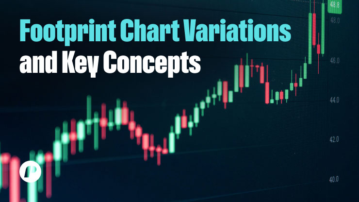
Types of Footprint Charts: Different Narratives, Specific Insights
Just as a photographer uses a series of lenses to take an image, there are numerous footprint charts that traders can use. Each will be used for a specific type of trade and will yield certain information about the market’s hidden mechanisms. Recognizing these variations enables you to choose the ideal tool to reveal information most suitable to your strategy, be it scalping, day trading, or swing trading.
Footprint Profile: Unveiling Liquidity Zones
A footprint profile presents the volume at each price level through a vertical histogram alongside footprint bars. It allows you to identify high-volume areas where liquidity pools. These areas are strong price magnets, representing where there is ample institutional interest or trader consensus. Knowing them helps guide potential areas of strong support or resistance before they manifest on standard charts. By charting these areas in depth, you can better anticipate future price action and mark entries and exits more effectively.
Bid/Ask Footprint: Identifying Aggressors
The bid/ask footprint adds color and depth to live volume, making it easier to see which aggressive buyers and sellers are present. It breaks down each trade into buyer-originating trades (striking the ask) and seller-originating trades (striking the bid). By looking at which side dominates at a given price, you have an instant look at which side is propelling the market—a green rush. The ask indicates that buying is frantic and prices are rising, while the red control on the bid shows that selling is intense and there’s overwhelming demand.
Delta Footprint: Confirming Trend Strength
The delta footprint focuses on the net difference between buying and selling volumes at each price level. Instead of showing bid and ask volumes separately, it aggregates them into one value—Delta. A consistently positive delta during an uptrend confirms buyers’ control, while a consistently negative delta in a downtrend signals sellers’ dominance. Divergences between price action and delta—for instance, rising prices accompanied by declining or negative delta—serve as early warnings of hidden weakness or potential reversals. This chart is particularly valuable for confirming trend strength and validating your trading assumptions.
Benefits and Comparisons: The Why and the How
Footprint charts offer a transparent view of the market’s true intentions. They go beyond simple price action to reveal the “why” behind a move, providing a distinct advantage. A key benefit is their ability to visualize liquidity and imbalances by highlighting areas with high concentrations of executed orders. Such liquidity pools, typically manifesting as high-volume clusters such as the POC, can be areas of intense support or resistance. Secondly, footprint charts allow one to identify early signs of trend exhaustion, divergence, and potential turning points, providing an additional source of confidence when making trade decisions.
Applications for Trading
Unlike a basic candlestick that provides only a summary of price movement, a footprint chart focuses intensely on order flow and volume at each price. This granular insight enables traders to move from a reactive to a proactive trading stance. Footprint charts are handy for scalping and day trading. They offer micro-timing accuracy to capture instantaneous delta action, near-term imbalance, or surprise volume spikes. Such findings minimize speculation and enable traders to make faster, better-informed decisions, a key consideration when trading high-volatility markets where split-second timing may be the difference between profitability and loss.

Trading Strategies and Technical Requirements
Mastering the market’s story requires the right tools and strategies. A footprint approach is an integrated style that uses a footprint chart to examine live order flow and make decisions based on it. It offers more than just the unadorned price; it reveals the volume and aggressiveness of buyers and sellers, identifying imbalances and the best entry and exit prices.
Technical Requirements
Footprint charts are not magic; they are executed with high-quality, live feeds. They display executed trades—not unexecuted limit orders—and use Level 2 data to compute total traded volume, delta, and imbalances. Without it, the charts are inaccurate or useless. Footprint size is the number of displayed executed orders that you can set to define the level of granularity. By seeing the way aggregated buy and sell volume, delta, and imbalances are calculated on the chart, you can get a better sense of patterns and expect market action.
Common Mistakes and Learning Curve: Avoiding the Pitfalls
There are traps in every trading tool. By understanding them, traders can maximize their first-hand experience with footprint charts.
Common Mistakes Beginners Make
Perhaps the most frequent error is over-analysis—attempting to explain every single number rather than looking at essential concepts such as delta and imbalances. Ignoring the broader context, including the overall trend or significant economic news, is another major error. Additionally, beginners often fail to practice consistently with real market data. Building visual intuition only comes through repeated observation and hands-on practice. Reviewing charts over multiple sessions enhances pattern recognition and builds the confidence needed to act decisively.
Navigating the Learning Curve
The learning curve for footprint charts can seem steep because it requires understanding complex concepts like volume profiles, delta, and bid-ask imbalances. However, a structured, patient approach makes it manageable. Start with a single familiar market and a single timeframe. Observe how volume clusters occur at specific prices and whether the market respects these areas over multiple tests. Gradually, you will develop the confidence to interpret imbalances, delta, and POC in real-time conditions.
The Best Footprint Chart Strategy
The most effective strategy depends on your trading style and goals. Imbalance trading, absorption trading, and delta divergence are all effective when applied correctly. Advanced traders often combine these approaches into a flexible system adaptable to different market conditions—from calm trends to volatile reversals. Consistently using these strategies while monitoring real-time order flow ensures actionable insights and better trade precision. This disciplined approach improves outcomes during funded trader evaluations and reinforces the value of footprint charts as a cornerstone of market analysis.

The Final Chapter: Conclusion
Footprint charts offer traders a clear advantage by providing an X-ray view of the market’s hidden narrative. Unlike standard charts that show only basic price movements, this tool reveals the “why” behind the moves. By visualizing the precise forces of supply and demand, footprint charts help traders understand the real-time battle between buyers and sellers. Analysis relies on key concepts like Delta, Imbalances, and the Point of Control (POC) to identify areas of liquidity and aggression. Mastering this chart is a crucial step toward becoming a more precise and disciplined trader, offering a strategic edge that no ordinary chart can match. Footprint charts transform a reactive trading style into a proactive one, providing actionable insights for better decision-making and long-term success.
If you liked this post make sure to share it!