
For intermediate to advanced stock traders, traditional candlestick charts present a significant limitation: they reveal where the price moved but completely obscure why and how it moved. This critical missing context—the underlying buying and selling pressure at each price level—represents the invisible battlefield where institutional and retail traders clash. Footprint charts address this fundamental gap by transforming opaque price action into transparent order flow data, allowing traders to observe the exact transactions occurring within each candle. But you might be wondering, what is footprint chart trading? — Footprint chart trading is a methodology that uses this granular data to make informed decisions by analyzing the precise forces of supply and demand. Think of these charts as providing x-ray vision into market dynamics, revealing not just the skeletal structure of price movement, but the actual muscle of volume and aggression behind every fluctuation.
Key Notes:
- What is a Footprint Chart?
- Understanding the Numbers
- Role of Delta
- How to Read the Footprint Chart
- Types of Footprint Charts
- Benefits and Comparisons
A Paradigm Shift in Analysis
The transition from traditional charts to footprint analysis represents a significant evolution in technical analysis. But what is an order flow footprint? — An order flow footprint is a visual representation of all executed transactions, detailing buying and selling volume at specific prices within each bar. This is also commonly referred to as footprint order flow. Whereas candlestick charts reveal merely open, high, low, and close (OHLC) values, footprint charts reveal the complete market auction process by showing how much volume traded at each exact price level and whether aggressive sellers or buyers triggered those trades. With such fine detail, traders can see institutional activity, discern potential reversals sooner, and tell the difference between real breakouts and false moves with much more precision.
For serious stock traders, this isn’t merely an incremental improvement—it’s a paradigm shift from following price to understanding the underlying supply and demand dynamics that ultimately drive all price movement.
Traditional Candlestick Charts vs. Footprint Charts
| Analysis Aspect | Traditional Candlestick Charts | Footprint Charts |
|---|---|---|
| Price Information | Open, High, Low, Close only | OHLC plus volume at each price level |
| Volume Data | Total volume per period (below the chart) | Volume is distributed across each price level within the candle |
| Market Participants | No differentiation between buyers and sellers | Clear identification of aggressive buyers vs. aggressive sellers |
| Market Context | Shows where the price moved | Reveals why and how the price moved through the order flow |
| Best For | Basic trend identification, simple support/resistance | Advanced order flow analysis, identifying institutional activity |
Key Components and Types of Footprint Charts
This section breaks down the essential internal elements of the Footprint Chart, providing traders with an understanding of how to interpret market aggression, price agreement, and institutional activity at a granular level. But what is an order flow footprint chart? — An order flow footprint chart is a detailed visual representation of market activity, showing executed buy and sell volume at specific price points. Similarly, what is a volume footprint chart? — A volume footprint chart is a specific type of order flow chart that displays the total volume traded at each price level without separating buy and sell activity. And what is a delta footprint chart? — A delta footprint chart focuses on the net difference between buying and selling volumes at each price level to show market aggression.
Critical Footprint Chart Elements
Mastering footprint charts requires thorough familiarity with their core components, each providing unique insights into market dynamics. But first, how to calculate a footprint? — A footprint is calculated by accessing real-time executed trade data (Level 2 data) and then aggregating the volume of buying and selling orders at each specific price level within a given time period.
1. Delta: Measuring Market Aggression
Delta, arguably the most influential metric, represents the net difference between buying and selling volume at individual price levels or across entire candles. Calculated as Volume at Ask (buying) minus Volume at Bid (selling), delta transforms abstract price movements into concrete measures of market aggression. A strongly positive delta indicates dominant bullish pressure, while profoundly negative values reveal overwhelming bearish control. The most powerful signals often emerge from delta divergences, where price moves in one direction while delta moves oppositely, exposing underlying weakness in the apparent trend.
2. Point of Control (POC) and Value Area (VA)
The Point of Control (POC) marks the price level within a specific timeframe where the highest trading volume occurred, representing the fairest price agreement between buyers and sellers during that period. Flanking the POC, the Value Area (VA) encompasses approximately 70% of the session’s total volume, bounded by the Value Area High (VAH) and Value Area Low (VAL). These zones identify where the majority of transactions occurred, establishing clear parameters for price acceptance versus rejection.
3. Identifying Volume Imbalances
Imbalances in volume result when trades strongly bias one side of the market at specific price points, typically signaling institutional activity or the liquidation of the order book. How to read an imbalance chart? — Reading an imbalance chart means you are looking for points where volume in one direction (buy/sell) well exceeds the other, usually in the ratio of at least 3-to-1, and this indicates a firm shove from one side of the market. Those imbalances often consist of stacked imbalances from one price point after the next, and this can be a sign of ongoing institutional activity that often precedes significant directional moves.
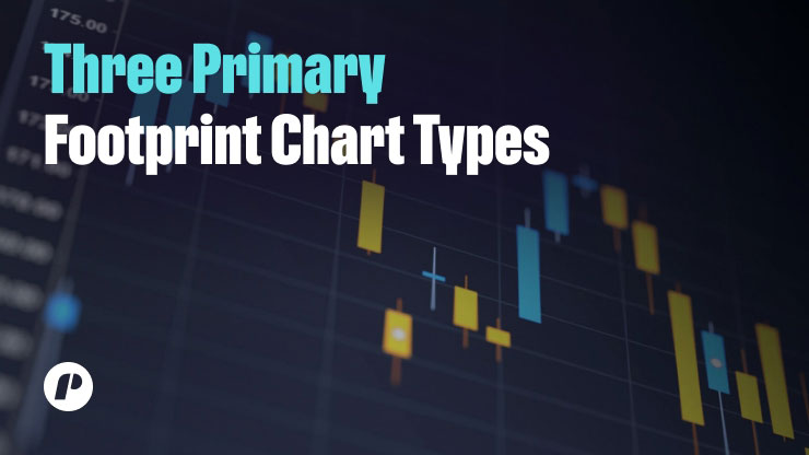
Three Primary Footprint Chart Types
Footprint charts come in several specialized formats, each emphasizing different aspects of order flow data.
1. Bid/Ask Footprint
This is the most detailed type. It displays separate columns for buy volume (on the right) and sell volume (on the left) at each price level. This provides a granular view of the battle between buyers and sellers, showing exactly where aggressive buyers “lifted offers” or sellers “hit bids.” This format is best for a deep dive into who is controlling the market at any given moment.
2. Delta Footprint
The Delta Footprint simplifies the presentation by displaying only the net difference between buying and selling volume at each level. This makes it easier to quickly assess market control and identify strength or weakness at key support and resistance levels without having to analyze two separate columns. This format is excellent for a rapid assessment of the market.
3. Volume Footprint
Also known as the Total Volume Footprint, this chart displays the cumulative volume at each price level without differentiating between buyers and sellers. While it sacrifices the bid/ask detail, it excels at identifying high-volume nodes (HVNs). These nodes often function as significant support or resistance zones because they represent areas of high market participation. Specific high-end sites also provide Imbalance Footprints, which automatically highlight instances where volume crosses a particular ratio and identify potential institutional activity.
How to Read and Interpret Footprint Charts Trading: A Step-by-Step Framework
In this section, we introduce a systematic method for reading footprint charts to comprehensively derive actionable trading insights from complex data. You may ask: How to read a footprint chart? — To read a footprint chart, traders can refer to the volume traded at each price point in the candlestick in real-time with the help of color-coded blocks or numbers and determine the buying and selling pressure, the imbalance, and the zones of liquidity. How to read a footprint chart for beginners? — Beginners should first take a look at the simplest things, such as the high-volume nodes and the bar delta in general, and see which part of the market prevails, and then proceed with the more advanced configurations.
Order Flow Analysis Fundamentals
Reading footprint charts effectively requires a systematic approach that begins with context establishment. How to analyze footprint charts? — To analyze a footprint chart, you need to evaluate the broader market context, perform a delta analysis for understanding aggression, determine large volume clusters, and search for imbalances. Continually evaluate the broader market context before assessing specific footprint candles, such as the current trend, main support and resistance levels on the bigger picture charts, and general market conditions. In doing so, the very first step ensures your order flow analysis works within the broader market structure and does not exist in isolation.
Next, carry out a delta analysis over multiple candles, observing the pattern rather than the individual values. An ongoing positive delta in an uptrend confirms healthy demand, whereas a drop in delta during rallies signals inherent weakness and potential reversal. The third critical step requires identifying large-volume clusters and understanding how they relate to price extremes. Finally, scan for pronounced volume imbalances at key technical levels, particularly stacked imbalances across multiple price points.
Volume-Price Relationship Analysis
The interplay between volume and price within footprint charts reveals critical information about market intent and potential direction. Absorption represents one of the most powerful volume-price phenomena, occurring when significant volume executes at a specific price level with minimal price movement. This pattern indicates that large limit orders are soaking up aggressive market orders, potentially signaling an imminent reversal. For example, if the price approaches a resistance level with substantial buying volume but fails to advance, it suggests hidden sellers absorbing all buying pressure, creating a potential shorting opportunity. Exhaustion patterns manifest when the price reaches new extremes, accompanied by declining delta or divergent volume patterns. These formations indicate that the dominant side is losing conviction, often preceding reversals. Additionally, failed auctions appear on footprint charts as price levels with minimal or zero volume at extremes, suggesting incomplete price exploration.

Practical Footprint Trading Strategies for Stock Traders
This section outlines several specific, actionable strategies that traders can use to apply footprint chart analysis to real-time market data. But how is a footprint chart used in trading? — A footprint chart is used in trading to confirm trends, identify potential reversals, and pinpoint precise entry and exit points by providing a clear view of where aggressive buyers and sellers are acting.
1. Absorption and Trapped Traders Strategy
This strategy capitalizes on one of the most reliable footprint patterns: institutional presence at critical support and resistance levels. How to identify liquidity zones? — To identify liquidity zones, look for high-volume clusters or areas of significant market participation, such as the Point of Control (POC), which often act as strong support or resistance levels where the price is likely to be “magnetized.” This approach requires identifying price zones where significant volume produces minimal price progress, indicating that large players are absorbing opposing pressure. The setup begins with identifying a key technical level—such as prior swing highs/lows, consolidation breakouts, or significant volume nodes. As price tests this level, the footprint should show substantial opposing volume with minimal price movement through the level. For example, at resistance, you would look for large sell volume (red numbers/imbalances) absorbing buy orders while the price struggles to advance.
Execution and Principles
The execution trigger occurs when the price shows rejection signals from the absorption zone, such as a bearish reversal candle or a delta flip from positive to negative. Entries should be taken on confirmation of rejection, with stop-losses placed beyond the absorption zone. The profit-taking target typically extends to the next significant support or resistance level. The psychological principle driving this strategy involves trapped traders—market participants who entered positions late as the absorption occurred. When price reverses against these trapped participants, their frantic covering accelerates the move, creating favorable risk-reward opportunities for traders who identified the absorption early.
2. Stacked Imbalances and Breakout Confirmation
Stacked imbalances are consecutive price levels exhibiting significant volume imbalances in the same direction, often indicating sustained institutional participation. This pattern provides high-probability breakout confirmation when detected at critical technical levels. The setup forms during consolidation periods near range boundaries, where the footprint reveals clusters of buy or sell imbalances accumulating at the range extremes. For instance, a series of buy imbalances (where buy volume significantly exceeds sell volume) stacking at the upper boundary of a consolidation suggests accumulation before an upward breakout.
Execution and Principles
The execution trigger occurs when the price breaks through the technical level with supporting delta and additional imbalances in the breakout direction. Entries should be taken as the breakout confirms, with stop-losses positioned below the most significant imbalance cluster (for long entries) or above it (for short entries). Profit targets can be established using measured moves based on the consolidation range or previous swing projections. This strategy’s effectiveness stems from its ability to distinguish genuine breakouts from false moves by confirming that institutional money supports the directional move. The stacked imbalances preceding the breakout indicate accumulation or distribution, while continuation imbalances during the breakout confirm sustained participation.
3. Delta Divergence for Reversal Anticipation
Delta divergence represents one of the most powerful leading indicators available in footprint analysis, often signaling potential reversals before traditional technical indicators. This strategy identifies discrepancies between price action and underlying buying/selling pressure. The setup occurs when the price establishes a new high or low while the delta fails to confirm the extreme. For example, in an up move, the price can mark a higher high, while the delta marks a lower high, indicating weak buying momentum despite the price upsurge. It indicates the move lacks confidence and can reverse in the opposite direction.
Execution and Principles
Execution requires patience—traders should wait for additional confirmation beyond the divergence alone. Typical entry triggers include a break of a short-term trendline, a reversal candle pattern at the extreme, or a flip in delta direction. Stop losses should be placed beyond the recent price extreme, while profit targets can be set at the nearest significant support/resistance level or based on the divergence’s size. The underlying principle of this strategy involves detecting exhaustion in the prevailing trend. While price may continue momentarily due to momentum, the declining delta reveals that the aggressive participants driving the trend are losing conviction, creating reversal opportunities with favorable risk-reward ratios for alert traders.
Platform Implementation and Practical Implementation Tips
This section provides a guide on the technical requirements and practical application of footprint charts, from initial setup to integrating them with broader market analysis. Are footprint charts applicable to day trading? — Footprint charts are highly suitable for day trading due to their ability to deliver the micro-timing precision required for determining short-term market changes, volume surges, and specific entry/exit points. In the same light, are footprint charts suitable for scalping? — Footprint charts are highly suitable for scalping due to their capability for delivering the fine-scale, up-to-the-minute information regarding order flow and aggressiveness required for making rapid, well-informed decisions for the purpose of obtaining small, fast-paced price movements.
Footprint Chart Setup and Configuration
Implementing footprint charts requires access to specialized trading platforms like Trade The Pool, a Limited Risk Trading Platform known for supporting advanced order flow analysis. When choosing suitable software, consider strong features in the presentation of volumetric data and the processing of information in real-time. To turn on footprint charts, users usually choose “Volume Footprint” or “Order Flow Footprint” from the chart types menu. Recommended settings include the “Delta” type for more precise readings, an “Auto” row size for adaptability to volatility, and 70% Value Area visualization. Professional-grade platforms offer highly customizable footprint charts with extensive configuration options, which serious traders value for their flexibility and analytical depth.
Configuring Your Footprint Chart
When configuring footprint charts, begin with the Delta Footprint view to simplify the learning process, as analyzing a single net value column proves substantially easier than processing separate bid/ask columns simultaneously. Adjust the row size appropriately for your trading instrument—smaller row sizes (fewer ticks per row) provide greater detail but can appear cluttered. In comparison, larger row sizes offer clearer patterns but may miss nuanced information. Establish a consistent color scheme (typically green for buying/bullish and red for selling/bearish) to facilitate rapid pattern recognition during fast market conditions. Finally, integrate cumulative delta as a secondary indicator to maintain perspective on longer-term buying/selling pressure beyond individual footprint bars.

Integrating Footprint Analysis with Market Context
Footprint charts generate their most significant value when correlated with a broader market context rather than used in isolation. Always align your footprint analysis with significant technical levels identified through traditional methods like horizontal support/resistance, trendlines, and key moving averages. The convergence of a footprint signal (like absorption or stacked imbalances) with a significant technical level substantially increases the probability of a successful trade. Similarly, incorporate multiple time frame analysis by examining footprint patterns on higher time frames to identify significant zones, then using lower-timeframe footprints for precise entry timing.
Considering Market Conditions
You should also consider wider market conditions like the trend direction, volatility conditions, and any fundamental news. For example, setups that reinforce the current trend are typically more reliable than those that go against it. During high volatility events like earnings announcements, the footprint chart can help distinguish actual institutional action from retail noise. By combining footprint analysis with a comprehensive trading system that respects multi-time-frame technical structures and market conditions, you can transform raw order flow feeds into actionable, high-probability trading setups.

Conclusion: Integrating Footprint Analysis Into Your Trading Process
Footprint charts are a game-changer in the world of technical analysis, transitioning traders from simply viewing prices in a passive state to active participation in unraveling market microstructure. The order flow clarity introduced by these charts in the market provides an undeniable advantage in identifying institutional activity, recognizing reversals earlier, and confirming breakout strength with greater confidence. However, this superior method requires studious learning and a commitment to practice because the initial experience can overwhelm new traders with info overload. Start with the application of a single facet, typically delta, and then progressively integrate more advanced concepts, including absorption and imbalance analysis in the process flow.
The best traders marry this robust methodology in a complete trading structure that honors classical technical analysis, risk principles, and market conditions. Footprint analysis should supplement—NOT supplant—your current techniques by allowing you a more in-depth understanding of the demand and supply forces acting below the price action. In the process, with more experience with these tools, you no longer react solely to the price action. Instead, you comprehend the market forces behind it and move from market-following behavior to forecasting its next move with educated precision.
If you liked this post make sure to share it!